
COMEX gold registered inventory just dropped to 17.58 million ounces—the lowest level in six months. But what does this chart actually tell us about market dynamics? Professional traders rely on warehouse data visualization to spot delivery stress, inventory depletion, and potential supply squeezes before they hit mainstream financial media.
Understanding COMEX inventory charts isn't just about reading numbers—it's about interpreting the visual patterns that reveal the true health of precious metals markets. These charts contain the DNA of supply and demand dynamics, showing when the market might be approaching critical stress points that could trigger explosive price moves.
In this comprehensive guide, you'll learn to decode every element of COMEX warehouse data like an institutional analyst, from basic registered vs eligible distinctions to advanced coverage ratio interpretation that can signal major market moves weeks in advance.
What Are COMEX Inventory Charts?
COMEX inventory charts visualize the daily warehouse stock reports published by CME Group, showing the physical metal holdings across approved depositories in New York. These charts track three critical metrics: eligible inventory (metal owned by parties who could deliver but haven't committed to do so), registered inventory (metal specifically earmarked for potential delivery against futures contracts), and total inventory (the sum of both categories).
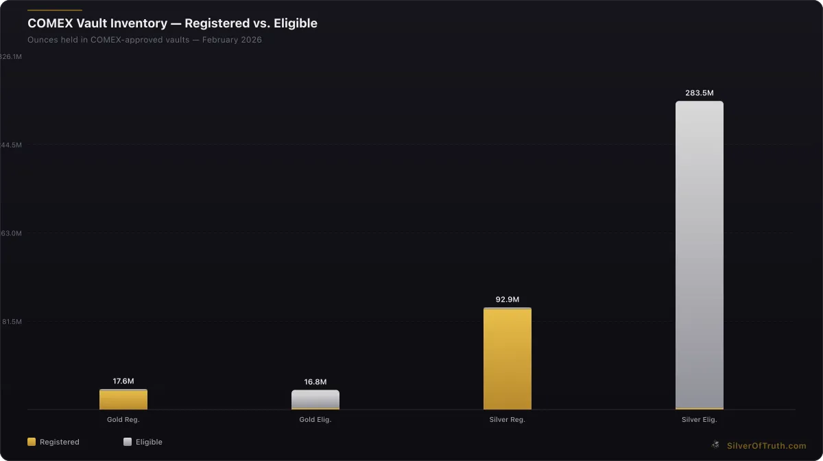
Source: SilverOfTruth COMEX data, February 2026
The charts update daily after 4:00 PM ET when CME releases the official warehouse reports. Each data point represents the collective holdings across multiple COMEX-approved depositories, including JP Morgan Chase Bank, HSBC Bank USA, Brink's Company, and Delaware Depository Service Company. The data reflects actual physical metal, not paper positions, making it one of the most reliable indicators of real supply conditions.
According to CME Group's official reporting standards, warehouse stocks must be reported daily by each depository, with strict penalties for inaccurate reporting. This regulatory oversight ensures the data integrity that makes these charts so valuable for market analysis.
Professional traders monitor these charts for several key patterns: sudden drops in registered inventory (indicating potential delivery stress), transfers from eligible to registered (suggesting preparation for delivery), and the relationship between inventory levels and open interest (the coverage ratio that signals squeeze risk).
Core Components of COMEX Warehouse Data
Registered vs Eligible Inventory
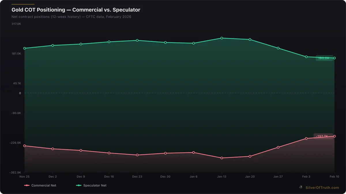
Gold COT positioning: commercial hedgers (red) vs. speculators (green). Source: CFTC via SilverOfTruth, February 2026
The most fundamental distinction in COMEX inventory charts is between registered and eligible metal. Registered inventory represents metal that has been specifically allocated for potential delivery against futures contracts. This metal is immediately available to fulfill delivery obligations and forms the critical buffer against supply shortages.
Currently, COMEX gold shows 17.58 million ounces registered versus 16.84 million ounces eligible—an unusual inversion where registered exceeds eligible. Typically, eligible inventory dominates because most warehouse metal isn't immediately needed for delivery. When registered surpasses eligible, it often signals market participants are positioning for potential physical offtake.
Eligible inventory consists of metal that meets COMEX quality standards and sits in approved warehouses but hasn't been allocated for delivery. Owners of eligible metal can convert it to registered status quickly, but this requires paperwork and often indicates intent to deliver or withdraw. The CFTC oversees these conversion processes to ensure market integrity.
Silver inventory tells a different story with 92.90 million ounces registered against 283.54 million ounces eligible. This 3:1 ratio of eligible to registered is more typical, suggesting silver warehouse owners are less prepared for immediate delivery compared to gold market participants.
Understanding these categories helps interpret chart movements. A sharp drop in registered inventory without corresponding eligible increases suggests actual metal withdrawal from the system. Conversely, transfers from eligible to registered without total inventory changes indicates positioning for potential delivery activity.
Reading Coverage Ratio Indicators
The coverage ratio—total inventory divided by open interest—is perhaps the most critical metric for predicting delivery stress. This ratio shows how many times the physical inventory could theoretically cover all outstanding futures contracts if every position demanded delivery.
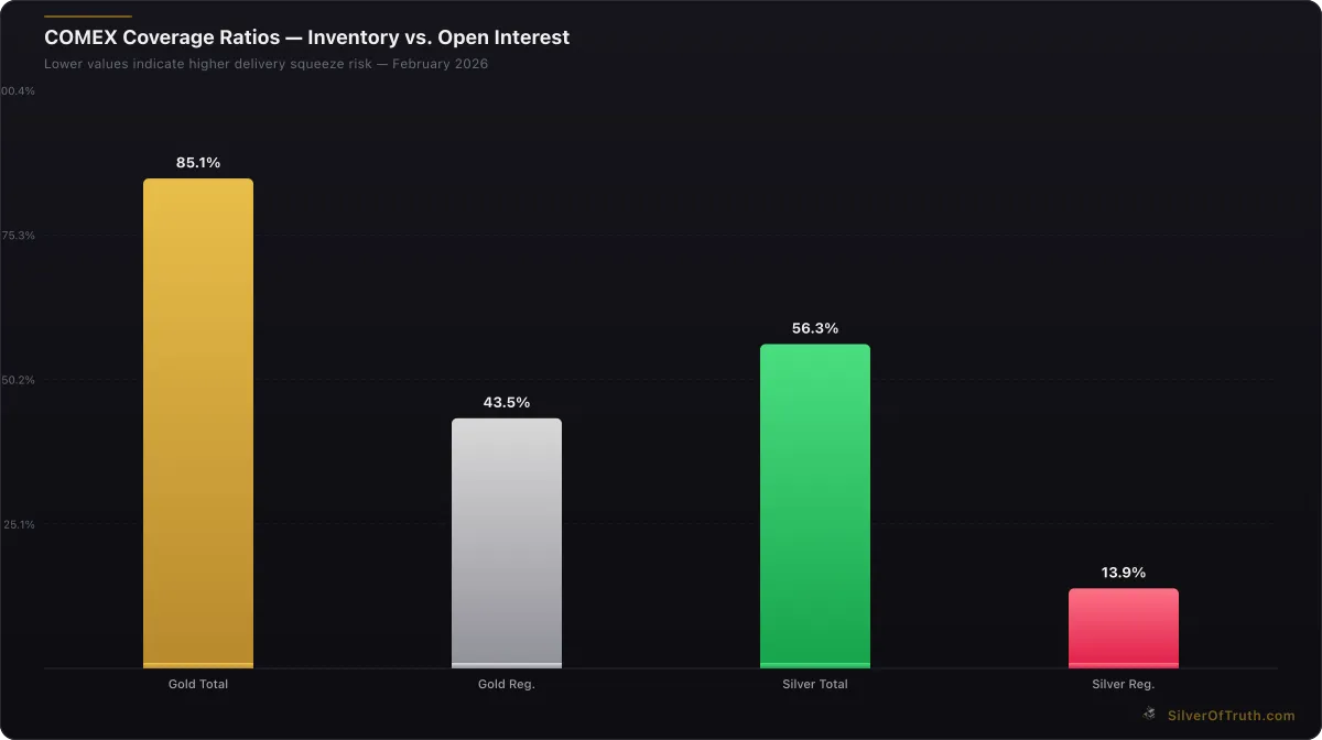
COMEX coverage ratios — lower values indicate higher delivery squeeze risk. Source: SilverOfTruth, February 2026
COMEX gold currently shows a coverage ratio of 85.1%, meaning registered plus eligible inventory equals 85% of the physical metal needed if all 404,391 open interest contracts stood for delivery. While 100% delivery is impossible (most futures contracts are cash-settled), ratios below 100% signal potential stress if physical demand accelerates.
The registered coverage ratio tells a more urgent story at 43.5% for gold. This means only the immediately deliverable metal could cover less than half of open interest. Our analysis of delivery squeeze risk indicators shows that ratios below 40% historically correlate with increased delivery activity and price volatility.
Silver presents higher risk with a total coverage ratio of 56.3% and registered coverage at just 13.9%. This means silver's immediately deliverable inventory covers less than 14% of open interest—a level that would trigger immediate concern in most commodity markets. The COMEX registered vs eligible dynamics explain why such low registered coverage creates delivery vulnerability.
Professional traders use coverage ratio charts to identify inflection points. Ratios declining toward 30% (registered) or 70% (total) often precede increased delivery notices, warehouse activity, and price volatility. The visual patterns on these charts—steep declines, plateau formations, or sudden recoveries—provide early warning signals for market stress.
Interpreting Daily Movement Patterns
COMEX inventory charts reveal their secrets through daily movement patterns that reflect underlying market dynamics. Today's gold data shows a modest -0.09% daily decline in total inventory, but the weekly trend reveals -3.03% and monthly shows -4.76% depletion—a clear acceleration in withdrawal activity.
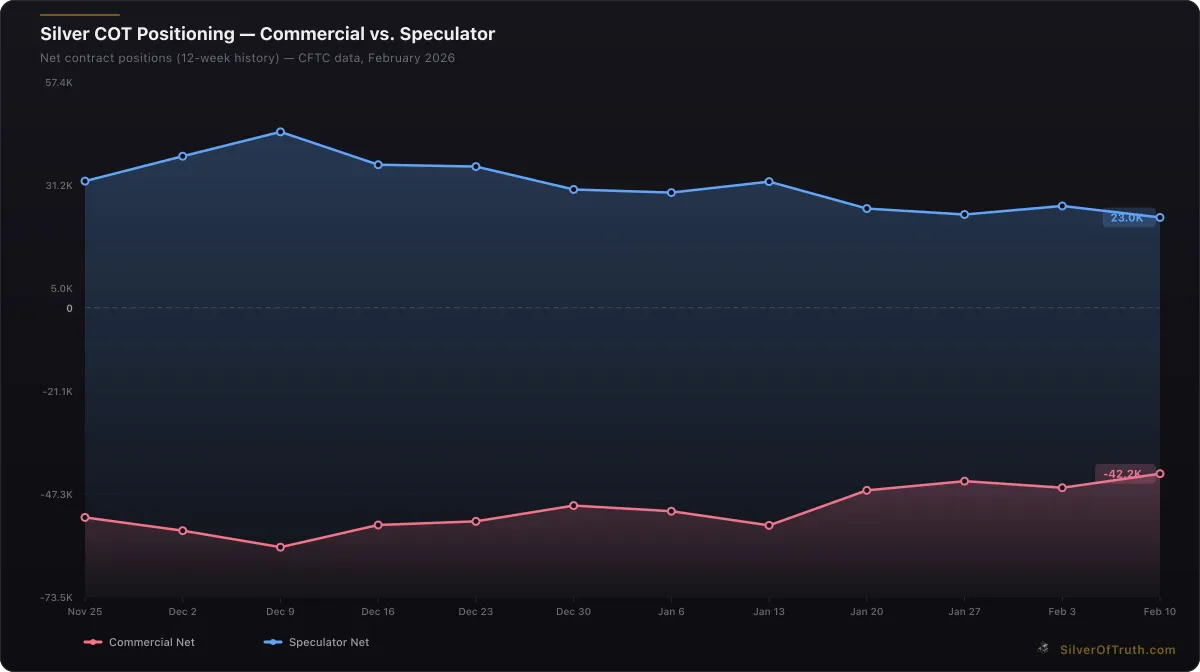
Silver COT positioning: commercial hedgers (red) vs. speculators (blue). Source: CFTC via SilverOfTruth, February 2026
These multi-timeframe patterns help distinguish between noise and signal. Single-day movements often reflect administrative transfers or routine warehouse operations. But consistent weekly declines, especially in registered inventory, suggest sustained physical demand that could stress the system if it continues.
Silver inventory declined -0.74% in total holdings, with the monthly depletion reaching significant levels. When combined with the high-risk coverage ratio, these movement patterns suggest silver faces more acute supply pressure than gold despite lower absolute prices.
The timing of inventory movements also matters. Significant changes during delivery months (March, May, July, September, December for gold; March, May, July, September, December for silver) often indicate actual delivery activity rather than warehouse shuffling. The patterns documented in our COMEX inventory analysis show how these seasonal dynamics interact with underlying supply trends.
Chart patterns to watch include: sudden multi-day declines (potential delivery stress), sawteeth patterns with lower highs (gradual depletion), and sharp reversals (new metal arrivals or delivery completion). Professional traders overlay these patterns with price action and COT positioning to build comprehensive market pictures.
Advanced Chart Analysis Techniques
Volume-Weighted Movement Analysis
Professional analysts don't just track raw inventory changes—they correlate warehouse movements with futures volume and open interest changes. High-volume trading days with significant inventory declines often signal informed participants pulling physical metal, while low-volume inventory changes may reflect routine warehouse operations.
The current COMEX data shows gold open interest declining -5,303 contracts alongside inventory depletion, suggesting coordinated position unwinding rather than delivery-driven withdrawals. This pattern differs from silver, where open interest remains elevated despite inventory stress, creating potential squeeze conditions.
Seasonal Adjustment Factors
Raw COMEX inventory charts can mislead without seasonal adjustment. Gold inventory typically builds in January-February (post-holiday restocking) and depletes in March (delivery month) and September-October (jewelry manufacturing season). Silver follows different patterns tied to industrial demand cycles and solar panel production schedules.
Current gold depletion in February is unusual—typically a building month. This out-of-season decline amplifies the significance of the -4.76% monthly depletion rate. Our historical ratio analysis provides context for these seasonal deviations and their market implications.
Cross-Metal Correlation Patterns
Advanced practitioners analyze COMEX charts across metals to identify system-wide stress. When both gold and silver show simultaneous registered inventory declines, it often indicates broader precious metals demand rather than metal-specific factors.
Current data reveals divergent patterns: gold registered inventory showing stress while silver shows more severe total system pressure. This divergence suggests different underlying drivers—possibly safe-haven demand for gold versus industrial/investment demand for silver.
Technology and Data Sources
Real-Time Data Integration
Modern COMEX inventory charts integrate multiple data streams beyond basic warehouse reports. Professional platforms combine inventory data with delivery notices, warrant issuance, and depository-specific holdings to create comprehensive supply pictures.
The SilverOfTruth app consolidates data from CME Group's official warehouse reports, COMEX delivery notices, and historical trend analysis into real-time chartsupdating every 30 seconds during market hours. This integration allows traders to spot developing patterns before they appear in mainstream financial media.
Data Quality and Verification
COMEX inventory data quality depends on accurate reporting by approved depositories. Each facility must submit daily reports by 4:00 PM ET, with CME Group publishing consolidated data shortly afterward. Discrepancies or late reports can create chart anomalies that experienced analysts learn to identify and filter.
Verification involves cross-referencing inventory changes with delivery notices, warrant activity, and depository-specific patterns. Sudden large changes in single depositories often reflect transfers rather than actual supply changes, while broad-based movements across multiple facilities indicate genuine market dynamics.
Common Interpretation Mistakes
Overreacting to Single-Day Movements
The most common error in COMEX chart analysis is overreacting to daily fluctuations. A 2 million ounce gold inventory decline might seem significant, but if it's followed by a 1.8 million ounce recovery, the net movement is minimal. Professional traders focus on weekly and monthly trends rather than daily noise.
Current gold data exemplifies this principle: today's -0.09% decline is minor, but the -4.76% monthly trend is significant. The silver supply deficit dynamics show how sustained trends matter more than individual data points.
Ignoring Open Interest Context
Inventory levels mean nothing without open interest context. A 50 million ounce silver inventory might seem ample, but if open interest represents 200 million ounces of potential delivery obligations, the supply situation is actually tight. Always calculate coverage ratios before drawing conclusions about inventory adequacy.
Misunderstanding Eligible Conversions
Sharp increases in registered inventory don't always indicate new metal arrivals. Often, they reflect conversions from eligible to registered status as owners position for potential delivery. True supply increases require total inventory growth, not just internal warehouse transfers.
Practical Application Strategies
Building Your Chart Reading Routine
Effective COMEX inventory analysis requires systematic daily review. Start with total inventory trends (weekly and monthly), then examine registered vs eligible splits, calculate coverage ratios, and finally correlate with recent price action and volume patterns.
Professional traders review COMEX charts at 4:30 PM ET after official data publication. They look for: unusual single-day movements (exceeding 1 million ounces gold or 5 million ounces silver), trend accelerations (weekly rates exceeding monthly rates), and coverage ratio changes (especially registered coverage approaching 40% or total coverage nearing 70%).
Integration with Other Market Data
COMEX inventory charts work best when combined with COT positioning data, Shanghai premiums, and retail demand indicators. High speculator positioning with declining inventory suggests potential squeeze conditions. Widening Shanghai premiums alongside COMEX depletion confirms global supply tightness.
Current market conditions show elevated gold speculator positioning (+160,012 net contracts) with inventory depletion—a combination that has historically preceded price volatility. Silver shows more balanced positioning but higher inventory stress, creating different risk-reward profiles.
Setting Alert Levels
Professional traders set systematic alerts for critical COMEX inventory thresholds. For gold: registered coverage below 40%, total coverage below 75%, or weekly depletion exceeding 5%. For silver: registered coverage below 15%, total coverage below 60%, or monthly depletion exceeding 10%.
These thresholds, based on historical analysis of delivery stress periods, provide early warning systems for potential market disruption. The SilverOfTruth app's alert system tracks these levels automatically, notifying users when critical thresholds approach.
Market Impact and Trading Implications
Price Discovery Mechanisms
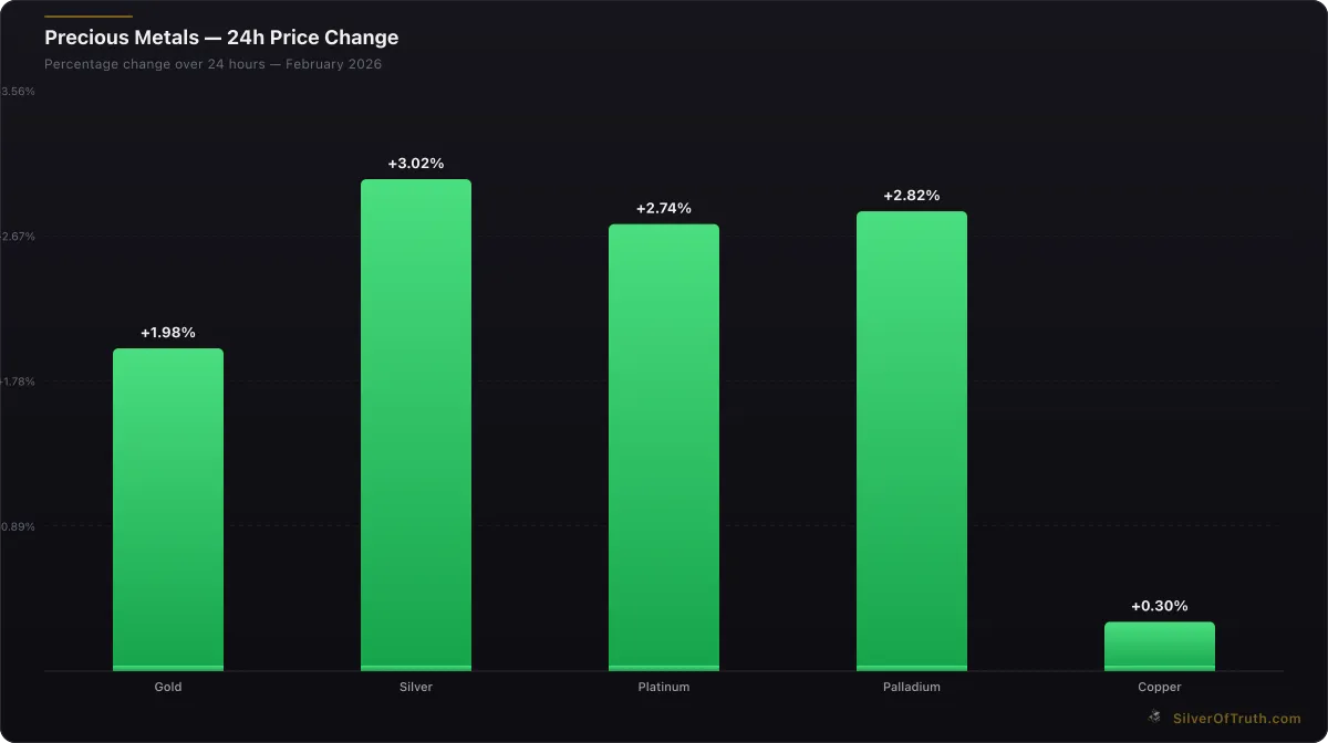
24-hour precious metals price changes. Source: SilverOfTruth, February 2026
COMEX inventory levels directly influence futures price discovery through the delivery mechanism. When inventory declines approach critical levels, futures prices must rise to either attract new supply or discourage delivery demands. This relationship makes inventory charts leading indicators for price movements.
The current gold inventory situation illustrates this dynamic. Registered coverage at 43.5% isn't immediately critical, but the -4.76% monthly depletion rate suggests approaching stress levels. If this rate continues, registered coverage could drop below 40% within 2-3 months, potentially triggering delivery premiums.
Arbitrage Opportunities
Sophisticated traders use COMEX inventory data to identify arbitrage opportunities between physical and paper markets. Low inventory levels often create delivery premiums that make physical purchase and futures sale profitable. These opportunities require precise timing and significant capital but can generate substantial returns during supply stress periods.
Risk Management Applications
Portfolio managers use COMEX inventory charts for risk management beyond just trading signals. Declining inventory with high open interest suggests increased price volatility risk. Conservative investors might reduce position sizes or hedge exposure when charts show approaching stress levels.
The integration of inventory analysis with gold/silver ratio trading strategies creates more sophisticated risk management frameworks. When both metals show inventory stress but at different severities, ratio trades can capture relative value while maintaining precious metals exposure.
FAQ Section
How often do COMEX inventory charts update?
COMEX inventory charts update daily after 4:00 PM ET when CME Group publishes official warehouse reports. Some professional platforms like SilverOfTruth provide more frequent updates during market hours by monitoring preliminary data sources, but the official daily figures remain the authoritative reference.
What's considered a dangerous coverage ratio level?
For registered coverage, levels below 40% historically correlate with increased delivery stress and potential supply premiums. Total coverage ratios below 70% indicate elevated risk conditions. However, these thresholds vary by metal—silver typically operates at lower coverage ratios than gold due to its industrial uses and different market structure.
Can eligible inventory be converted to registered immediately?
Converting eligible to registered inventory typically requires 1-3 business days for paperwork processing and CME approval. While not immediate, the conversion process is routine and rarely fails if the metal meets quality standards. This convertibility means eligible inventory provides a buffer against sudden registered depletion.
How do seasonal patterns affect inventory interpretation?
COMEX inventory follows predictable seasonal patterns tied to delivery months, holiday demand, and industrial cycles. Gold typically builds inventory in January-February and depletes during March delivery and autumn jewelry seasons. Silver patterns depend more on industrial demand and solar panel manufacturing cycles. Current February depletion in gold is unusual and therefore more significant.
What causes sudden large inventory changes?
Single-day changes exceeding 5% usually reflect administrative transfers between depositories, new metal arrivals from refineries, or completion of large delivery obligations. Gradual changes over several days more likely indicate actual supply/demand imbalances. Professional analysis distinguishes between these causes by examining patterns across multiple depositories and correlating with delivery notices.
Conclusion
COMEX inventory charts provide the clearest window into precious metals supply dynamics, revealing stress points and opportunities invisible in price charts alone. The current data showing gold registered inventory at 17.58 million ounces with 43.5% coverage, alongside silver's more severe 13.9% registered coverage, demonstrates why professional traders prioritize these indicators.
The key to successful chart interpretation lies in understanding the context behind the numbers—distinguishing between administrative transfers and real supply changes, recognizing seasonal patterns, and calculating meaningful coverage ratios. Today's modest daily declines become significant when viewed against monthly depletion trends exceeding 4% in gold and even higher rates in silver.
As inventory stress builds in both metals, the charts suggest approaching inflection points that could trigger increased delivery activity and price volatility. Professional traders are already positioning for these scenarios, using the advance warning these charts provide to optimize entry and exit timing.
Track real-time COMEX inventory movements and coverage ratios with advanced charting tools in the SilverOfTruth app — available on the App Store for comprehensive precious metals analysis.
Disclaimer: This article is for informational and educational purposes only and does not constitute financial, investment, or trading advice. Past performance is not indicative of future results. Always conduct your own research and consult with a qualified financial advisor before making investment decisions. SilverOfTruth provides market data and analysis tools — it does not provide personalized financial advice.